Monday, 12 November 2012

ITAP; week 7, Principle 3 - Medium

Principle 3 Medium


     Dan Mountford is a practitioner who can demonstrate the benefits of working within a variety of different environments, establishing his work, formulating a reputation and gaining personal life experience through doing so.
    Currently Mountford is a student who is based in Brighton, who works predominantly within the fields of photography, graphic design, editorial and motion design. Through his many disciplines he has the ability to collaborate his work, and continue creating an extensive portfolio offering his variety of skills and knowledge basis to a number of clients because of his ability to manipulate imagery to suit a variety of purposes.
   Through working alone, Mountford has the desire to work to his own personal tailor ship, choosing his work basis, and developing his skills through further experimentation allowing him to progress within a narrowing field. However, from working within internships, and commercial based work, this has allowed him to gain establishment and recognition with a number of brands and agencies I.e


  • The Economist
  • EMI Records
  • Urban Outfitters.
   Furthermore, as a result of working within these brands and agencies, he has had to collaborate and conjoin his work with a number of different visual communicators, giving him an incite into other practitioners work, which has lead to him becoming an influence upon their work, and in turn their style and methods have influence him.
  By working within a group, a brand, an agency or company, it can allow you opportunities to enhance and refine your stylisation of work to continue working within one area. On the other hand it could lead to opportunities to expand your working field, giving yourself a reputation which can introduce you to new clients, and areas of work.


   There are a number of different social media networking sites that can be used to advertise and promote your visual pieces, the most commonly used are:
  1. Blogger
  2. Facebook
  3. Flickr
  4. Instagram
  5. Twitter
   Using social media and networking it offers valuable links to potential and future clients, which can be delivered to them through your own personal space of advertising, also by interlinking each area of your work to various pages it can create a connectivity so that people can browse your page through interest, and spread the information through word of mouth. This is the quickest method of being noticed, and a way to gain critical comments upon your work to help you develop your methods.
   Another way which you can advertise yourself to get your work into the public domain, is by entering a number of online competitions, these can be also found on artists web pages who want young aspiring artists to collaborate with them, or through local newspapers.


ITAP; week 7, Principle 2 - Delivery

Principle 2 Delivery


   Studying the idea of delivery from an artist, I chose to researchMinjae Lee (Greno), focusing mainly upon his originality, and spontaneity when creating such intense pieces which captivate the audiences attention, due to the abstract nature of his work. As an artist he produces his imagery from the inspiration of the human face, and his fascination in colour. The interest of him as an artist is apparent as it is shown consistently throughout his work, but what is most interesting about his work and how he delivers his pieces, is due to how he has the ability to create a certain depth to his work through his use of colour, capturing the idea of emotion, character and personality as well as a certain kind of serenity.    
   Although his style of work does not vary to a degree, and uses the same subject focus of the human face, since Lee has a variety of different disciplines within art, he uses his knowledge and ability to translate his ideas in various forms using a range in media, materials and technologies. Often beginning with a dry media, Lee will then translate his imagery into a graphic form of communication, gaining the richness and fluid movement of expressionism through mark making, and organisation, enhancement and typography through the use of technology, blending the combined elements together.

  The artwork of Lee has been used to a great effect as he has found ways of embracing new forms of media, technology and ways in which he can combine them together to create his visual communication of imagery. By translating different messages through different variations of the media he has the ability to interlink his ideas so that they can be promoted, advertised and exposed in a variety of different formats, which is useful for when based within commercial work as he currently is, showing how adaptable and versatile his nature of working can be.


ITAP; week 6, Principle 2 - Narrative Techniques in Context

Principle 2 Narrative Techniques in Context

 
   Each piece of artwork or art form has been created with layers of narrative to relate to the meaning/context of the brand or form that has been produced. Considering the meaning of each piece it will often create some connectivity to religion, cultural occurrences and developments, as well as making historical references, reconceptualising its principles and meanings to create something that appears to be original or has elements of authenticity.
   Another approach to creating narrative in context is the use of personal experiences, preserving them within a visual manner, creating a different reaction for the audience creating a deeper connection with the piece because of its meaningful content.


   Tracey Emin, is a conceptual artist who creates layers to her work to revolve around her emotions, state of mind or memories that have the ability to influence her ideas, creating questions for the audience to ask due the minimal descriptions accompanying each piece that she creates. This therefore formulates layers to her work, because of its in depth meanings and its elements of secrecy and privacy despite its publication, distinguishing each element of her personality in each piece.  What is most exciting about her work is the various medias, materials and methods of creation she uses to express her repressed emotions, signifying her life experiences through sculptural, electronic and illustrated based pieces, making each an individual and unique/authentic piece.

 
  Jamie Reid, the producer of The Sex Pistols album cover “God Save The Queen” has created an art form which has been formulated using elements of the culture shift, and specific events which were going to have an effect upon the culture such as the Silver Jubilee (1977). Through this design he has created a piece which has appropriated the use of the Queen as a figure, using the Queen as the narrative for the design. By reconcetextulising the piece as though it has been produced to be a ransom note, with the design elements of the torn news paper clippings as a use of typography, it creates a relatable narrative to the lyrical concept, using the context of the piece as though the queen does need saving, aswell as creating the idea of a censorship of her identity. By using this form of narrative within context, it makes the pieces more structured and of lesser offence to the audience, or the subject who has been used for the content. Several other variations of “God Save The Queen” album artwork were produced and are actually in legal terms because of the dismissal of appropriation, creating an offensive narrative because of the context.


ITAP; week 6, Principle 1 - Developing Narrative

Principle 1 Developing Narrative 

   The creation of narrative for the formulation of an ideology for the production of a film, is often subject to the basis of the classical structure of the dominant narrative form found in Hollywood cinema. This classic narrative focuses upon the idea of Central Conflict, using the character basis of a Protagonist and also and Antagonist (Good vs. Evil).
   The “Three Act Structure” is often based around the classic narrative’s structure, formulating a chronologically flowing sequence of events creating, a beginning, middle and an end, (or a set up, confrontation, and a resolution / equilibrium, disequilibrium, and a equilibrium sequence). However, this structure is not always successful for those films that have abandoned the classic narrative.
   There are alternatives to this typical narrative which break the consistency of cinematic pieces, creating and formulating structures of non linear stories, and parallel created stories. These, particular types of narrative make a deeper connection to the audience because of the relation and empathy which can be emoted, as it seems a more realistic situation which can be relatable to the audience.

 
   Pulp Fiction, and Snatch are prime examples of Parallel structured story lines. These narratives are based upon storylines that intercept with one another conjoining the separate elements of the story line, to become integrated and interlinked during certain points of the film, intercepting the story line showing the connection between each individual character when their paths have been crossed.
   The Dark Knight Rises and Pan’s Labyrinth are examples of Non-Linear narratives. This particular type of narrative are where events have been created so that they do not create a piece that has a direction sequence to flow in chronological order. By doing so, this is creating the connection to the audience through the imitation and mimicking of the human memory creating flashbacks, reverting to the beginning, middle and the end of the story line at any given time during the film, giving an incite into the characters mind set.


Monday, 5 November 2012

ITAP; week 5, Principle 4 - Critical Commentary on Tone of Voice

Principle 4 Critical Commentary on Tone of Voice

 
The use of typography can change the tone of voice of what you are trying to communicate, for example whether it is legible or does it suit the phrase or word in which you are trying to communicate to give visual impact i.e WHISPER.This gives a visual impact upon the audience engaging with the piece of text, but does it communicate the idea of tone through this use of typography? On this occasion this type of contrast is not appropriated, however if it is used within the according environment, the impact of the word would seem more efficient. Therefore the use of typography needs to be considered when being applied, appropriating the correct manner of visuals to accompany the textual basis, harmonising them so they begin to work in not just a legible way, but work conceptually.


   An example of tone is shown in the titling of the web page, using a very grunge effect in a vintage manner, leaving the branding of the name to not sound violent but to incorporate the stylisation of the typography to suit the stylisation of the fashion elements of the branding.
   Further more, the typography used for the web design has been used in a neautral form to be appealing to a unisex audience, showing clear advertisment to a mixed audience, as well as indicating the key areas through use of bold typography showing the importance of each category. The design features of this web design are also legible due to the clarity of the text and the size of the type face.
   This is a second example of a website which has used a different tone to appeal to a female target audience. This page is illegible due to the use of yellow which is not visible, however the use of text does not give variation in tone as it is similar through out the design, using only bold font to make the key information stand out the audience more clearly, using the colour pink to make it more feminine to suit the audience, making its exclusiveness to women distinguished.


ITAP; week 5, Principle 1 - Legibility

Principle 1 Legibility

The legibility of a layout, a form of textual information, or the use of colour co ordination, are of key importance when trying to clearly communicate an idea, a message or information to an audience, making it understandable through its clarity. The legibility is an insurance that the product, textual information, or colour co ordination is easily understandable to an audience, often leaving the design basis of the piece which is being communicated, to be quite simplistic apposed to leaving a visual impact, therefore making the design features and key elements less memorable because of the minimalist design.
   However, some pieces are made to illegible to create a visual impact, making the idea of aesthetics more interesting for the target audience. Elements such as the layout, the font size, use of colour or overlaying of textual information over imagery is often deliberate and intentional to change the legibility to produce a more creative approach when designing particular pieces. In addition to this, also the illegibility of a text can be often apparent to create a contrast to the imagery that it is accompanying, for example, advertising about people with hearing difficulties and using very small typography, thus enhancing the impact of the advertisment.

   David Carson is a prime example of one artist who deliberately uses illegible design element within his pieces, this causes the audience to question his work and look more deeply within each piece to depict the meaning and the understanding of the typography which has been distorted, or combined with visual photographic images.


   Examples of Carson’s work as shown above clearly demonstrate the illegibility of his work. With his mass use of techniques and formulation of layout, causing distortion to the text as the use of colour clashes with the outlining of the imagery which has been used as a background layer. Further more the combination of layers in both foreground and background causes the clarity of the piece to be some what vague, however because of the artistic nature of this piece it creates visual impact intriguing the audience to look closer at the imagery to determine what the pieces message/meaning is.
   His style of his “grunge typography” has become some what of an influence upon other graphic designers, and demonstrates the idea that legibility is often not essential when designing a piece, as distortion of visuals generating more audience attention through impact.

   Examples such as newspapers are prime pieces which demonstrate legibility, giving a clear structure working in columns of three to give condensable and digestible amounts of information in an organised manner.
    Despite the fact that the 9pt font appears very small and can often be difficult to read, this is the legible font size for a newspaper, also there is a consistent use of font which runs through out the news paper, showing the flow of the articles, and furthermore making it easy to understand due to the clarity of the typeface. Finally the use of colour within the structure of this piece makes it easy to understand, and it is clearly visible the messages which are being communicated due to the standard black typeface.

Things To Consider;
   Due to our group magazine being created of a more art based aesthetic, we could consider the influence of typographers to create visually impacting pieces which are illegible for effect, to give variety and variation to our completed piece. However, for the pieces of text which are to be used for and article, as a group we should consider the idea of legibility, this will allow the viewer ability to read the articles with ease, also using a column structure so that the layout is clearly structured, and can not cause confusion.


Monday, 22 October 2012

ITAP; week 4, Principle 4 - Development of Personal Visual Vocabulary

Principle 4; Development of personal Visual Vocabulary


    Visual language is the significance and understanding of drawing, media, exploration and image making for creating a personal visual language. Each individual practitioner has their own methods of how they wish to create and preserve their visual language, varying the media and materials often to meet the context of their work, making it personal through using a specific stylisation.
   Critical evaluation of drawing and creating a visual language is significant, as this can encourage the idea of improvements that they can include within a piece to create development of future art forms. However, it can also be used as guidance to the audience giving inclinations, and indications to how the artist thinks, and what relevance the particular piece has to them as an artist, or what relevance it can have to the audience, and how it can reach them upon a personal level.
   Media experimentation is also of importance to visual vocabulary, finding the appropriate media which suits you as a practitioner to enable you to communicate your ideas thoroughly to an audience.


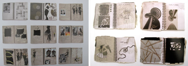
 Here is an example of a practitioners work who collects Polaroid images from various locations to communicate their visual experience using visual vocabulary, they also accompany their imagery with text to depict time frames of when they were taken or why they were taken, creating story boards from them.

 
Another example of a practitioners work where they combine elements of collected pieces to influence their fashion work, using these elements for ideas of texture shapes and form, using evaluative notes to communicate her visual language and the purpose of the work.
 
 
In addition to this another practitioner, once again using completely different methods from the previous two, collecting items from magazines, stamps, note books etc, to cultivate information that they can create into a visual piece by applying these sources together, creating almost a collage. Another difference between this practitioner and the other example is that the practitioner does not write notations down of the purpose of the piece, leaving the imagery upon the page to do that for itself.
 
Personal Reflection From The Lecture:
   To engage myself within the idea of creating in-depth conceptual pieces, I will need a clear understanding of the significance and purpose of my work, using all the key elements of design to develop my own personal visual language, using media experimentation, evaluation of drawing, proactively researching into a variety of practitioners to see how they have created accomplished pieces.
   I also will need to consider as a practitioner myself, what qualities do I respond to? How do I resolve things? What medias do I use? And finally, Are other practitioner’s works relevant to mine?

ITAP; week 4, Principle 3 - The Notion of Inspiration

Principle 3 The Notion of Inspiration


Inspiration can be found in a variety of different forms, just as recording them can be produced in a variety of different forms, creating a visual/recorded memory of occurrences which have inspired your notion of thought processing for an ideology. Through a constant process of inquiry to observation and experimentation, through researching and observing the final result will have a narrative, and be innovated apposed to imitated as it has been derived from personal experience.

The illustrator Paul Davis, finds that boredom is the enemy of an artist, so as an illustrator to gain fresh inspiration, he carries a small sketch book with him to collect and obtain information, making notations of conversations, atmosphere, culture, and general surroundings enabling him to begin designing some pieces with prosaic indifference and others with flair and imagination.
   He uses his sense of humour to offer an ultimatum on the spectrum of understanding his work, creating this own representation of the world and all that inhabits it. This visual representation is derived from with all the visual influences that have surrounded him, as well as everything he has absorbed from people who surround him, contained within his small sketch book.
 
Inspire work for Magazine Project;
   By engaging myself within methods such as Paul Davis uses, by recording findings, conversations, making visual commentary of my surroundings, either by taking photographs or creating sketches, this could improve the quality of my work, helping me to engage further within this topical theme/area.
   In addition to this, through researching and understanding these problems that I wish to resolve using Visual Communication, from being proactive and conducting the research in a practical manner this will improve the quality of my work, increasing my knowledge upon a subject, and furthermore, enabling me to be more analytical in a coherent form.

Monday, 15 October 2012

ITAP; week 3, Principle 3 - Relationships Developed From Existing Forms Of Culture

Principle 3 Relationships Developed From Existing Forms Of Culture

  
   The original intention of the cultural pieces have been recontextulised ideas and concepts in contemporary culture, reintroducing the ideas of religion and culture into a more modernised mannerism, fitting in with the current climate and society, adapting the context of pieces to be able to reach the audience upon a range of different levels, utilising modern theory as well as historical theory.
   In modern society, many commercial groups such as Vogue use reference to historical imagery to create campaigns to promote, and advertise products through photography, using the original source image as the influence for the photo shoot.


    However, despite the artists intentions of authentication of creating a more pastiche piece based of an original concept and art form, it is believed that this could be classified as cultural vandalism through the recontextulised pieces, making reference to religious and historical works of art, besmirching their relevance and importance of the original art pieces relation to culture, such as the artists the Chapman Brothers.
 

Botticelli - Venus and Mars - 1484
 
The original concept of this imagery is based around the idea that love conquers all, as Mars, the god of war is left unarmed and relaxed with his lover Venus, showing the power of their connection, it also shows the peaceful and tranquil environment through their surroundings encouraging the idea this is what has made Mars so relaxed.The family environment shows the royalties that they have in life, are surrounding them without the need for wealth or power.  

 
David Lachapelle - The Rape of Africa - 2009
 
This is the reconceptualised imagery of Botticelli's original piece, showing the change in culture in modern society, but still using the cultural aspects of the original piece. The undescriptor of this image gives a slight indication to the context of the imagery and what the content of the photograph is designed to emote to the audience.
   The visual elements within the imagery have been intensified within this authentic adaptation of the original image, showing the development over time and the development of culture over time. This reconceptualised adaptation shows the contrast of how the previous cultural visualisation of a simplistic, calm and loving environment, is compared to Lachapelle's cultural visualisation of our current society of destruction, the occurrence of violence, and greed.
   Considering the concept of the differentiation of these two images, they share similar qualities due to Lachapelle using Botticelli's work for cultural reference and as a source for him to reshape the idea of culture through time producing pastiche work based on the original image. Therefore this shows a development of relationship of contemporary art forms, and historical cultural pieces.


ITAP; week 3, Principle 1 - Notions of Originality

Principle 1 Notions of Originality

 
Originality appears to be no longer existent, and the notions of it are more appropriate to be classified as the authenticity of the concept of the imagery, which has been formed through manipulation of some one else’s original idea.
   Works of art are now often worked around developing a new concept, and context of an old art form. Developing and regenerating old ideas, thoroughly regurgitating the old art form to exhaust the key elements of its design, and purpose, therefore creates something that can be seen as "original", and innovative by viewers who are unaware of where the formal idea has been generated, and stolen from.
   Picasso once quoted - "great minds steal", this is an indication that it should not be a concealed fact, it is an obvious truth that should be celebrated, because of how invaluable this authenticity is, considering the known fact that originality that artists aspire for, is non existent.


Referring to the quotation in which Picasso had previously stated, here is a prime example of acknowledgement that "great minds steal".
 
          Las Meninas - 1656 - Diego de Silva Velazquez                  Las Meninas - 1957 - Pablo Picasso
The original image which was created by the artisan Diego de Silva Velazquez, who later come to influence the work of Pablo Picasso. Picasso “stole” this idea to recreate a more abstract form of the original piece, changing the context of the piece to fit the purpose and meaning he wanted to portray to his audience. Picasso had created a more pastiche piece, creating an authentic art form generated from the ideas and influence of the artisan.
   By reshaping and reworking the previous ideas, Picasso has therefore created a more personalised piece which shows clear relation and influence from the original piece to create these new intentions for authenticity, adapting the content by manipulation of the previous piece making it more signature to his stylisation.
   However, despite him reincarnating the piece as such, Picasso has chosen to embody same principles of the image as the previous artist has, by allowing the title for the piece to remain and through the use of similar design features as in the previous piece, such as the people, their gender and how they are situated within the piece.


Monday, 8 October 2012

ITAP; week 2, Principle 1 - Overcoming Mindset

Principle 1 Overcoming Mindset

 
   As a practitioner I continuously revolve around a selective amount of mediums and processes which produce the same result and give no reflection of character of myself, or personify the piece which I want to intensify. I have therefore created a deliberate habitual mode, and strategy of thinking, and need to release my inner critic which I tend to revolve my basis of work around, producing pieces which show a simultaneous pattern of likeness giving predictable results.
These images are a perfect example of my habitual mode of creativity and inner critic which controls the elements of my creative nature, restricting me to using only typical mediums and processes of design using common materials and utensils, due to my over compulsive comfortability with working with these mediums and materials.
   Although I have a tendency to continuously revolve my practices around a certain stylisation of my pieces, I feel that this does reflect me as an individual, through my sketchy notions and exaggerated features, yet not so much so that it does not specifically categorise me. This is something in particular in which I would not wish to change as a practitioner, but merely develop this stylisation and expand on to be more playful with my work, and consider fresh ways of processing giving me more critical awareness through this observation and subconscious awareness of habit.
 
Reflecting upon this idea of my typical mind set, looking back to previous examples of work, I believe there are various ways in which I can create fresh perspectives upon my creativity, breaking the mould of my repetitive strain of creative design on my own behalf.
   These examples of work I was restricting my mark making style because of how uncomfortable I felt at first using this new wet medium apposed to a dry medium, I found that after the first three attempts to be very controlled because of my judgemental opinion upon painting trying to change my stylisation, I found that these images were unsuccessful and were not expressive enough. (First set of 3 images)
   However once realising this I found that the more marks I made and the darker and uncontrolled I made my painting stylisation it reflected my personality more, and defined my characteristics within the final image, which I found to be relatable to me as an individual. (Second set of 3 images)


Although I find it difficult to attempt to try new, fresh and innovative ways to develop myself as a practitioner, there are particular ways in which I can over come my mind set to free my habitual mode of creative thinking, leaving me with less predictable results, even if the results are unsuccessful this will still allow development to occur to refine this practice.
   My four images of self portraiture shown above, have been developed using different mediums, materials and techniques, expressing my creative nature in various different ways, although I found it difficult to engage with, I found that the results were more successful than first considered.

Ways to overcome my own creative Mindset;
  • Consider the idea of collaboration, combing elements of Fine Art, Photography, Illustration, Textiles etc.
  • Expand on my knowledge of practitioners, varying my influence to encourage different styles of working apposed to looking at similar artists to the ones who currently inspire me.
  • Begin to sample different techniques using a variety of different mediums and materials which you can include within you RVJ, giving RCC upon them to mind map how you could develop these ideas, and how you could incorporate them appropriately within your work.
  • Consider the use of technology, expanding your knowledge and understanding of computer software and its importance within the advancing of industry, and how it can help improve the quality of my work.
  • Finally, before beginning a project, reflect on my ideas before starting, consider a numerous amount of approaches before attempting the brief. This will help avoid the predictable results, and help refine my ideas, increasing my creative thinking, avoiding enquiring into my typical choice of mediums and materials.

  • Wednesday, 3 October 2012

    ITAP; week 2, Principle 5 - Managing a Creative Environment

    Principle 5 Managing a Creative Environment

     
    A creative environment has its own personal meaning to each individual and how they choose to utilise the space in which they work within. Work spaces can have different effects upon how you work when within these environments, some allow you to explore ideas of culture, and decorative pattern, others allow more conscious awareness to engage in a more structured session of design or thought. Furthermore, a work space/creative environment should be personal to whom ever is working within it; to gain inspiration, allow concentration and the expansion of thought processing, stimulating the mind of the person occupying this space.
     

    From this image, it displays the organisation and availability of my mediums and equipment which I am freely able to work with. However, in comparison to practitioners, my supplies are basic and limited, so I would need to engage within other working environments to access more technical equipment, and technology. 
        The make up of my creative environment is simplistic, and contains a variety of cultural aspects, this through my habit of collecting small trinkets when visiting foreign destinations, which relate to religion, or the leisure and culture of the country itself. By having these items it allows me to broaden my mind and be more diverse when experimenting and making reference to culture. I also have many areas within my room which relate to my memories and experiences in life, these are often used as trigger pieces when wanting to make reference to a particular theme. By having this comfortable, organised and minimalist work space which relates to my thoughts and character, it allows me to be relaxed and have intense sessions of thought when being surrounded by materials which I use as reservoirs for my unconscious thoughts. In addition to this because of the size of my working environment it gives me a confide working space to captivate my thought process, and allows me freedom in the solitary environment to find a comfortable place to work within, due to its adaptability fitting my personal requirements, and giving limited distractions.
     
    These creative environments were ones in which I used to inhabit during my years spent in high school. These work space allowed a creative flow of energy because of all the display work which was available, making this environment very intense and vibrant with colour, creating a unique atmosphere. When working within them it allowed you to engage with other students work which was presented around the work space, and also artist's work which was also displayed. By seeing this versatile and cosmopolitan amount of work, it encouraged influence and source to make reference to giving progression and enhancement within your pieces. Furthermore, due to the layout of these rooms, the mediums and materials are available in the allocated and appropriate areas of use, making it easily accessible and freely available to use as well as being safe to use.
        However, often within a shared creative environment, there is often distractions and uncomfortable work spaces (as shown within these images), making the engagement with your work somewhat detached because of these occurrences with disjoint your concentration. Therefore workspaces which are allocated to a single person are much more personalised, and allow concentrated reflection, thought process as well as clarity and coherence when decision making because of the lack of distractions.

    For personal reflection:
       Taking elements from these creative environment for the development of my own creative working environment, I could display previous pieces of my completed art forms, and include pieces within my environment of practitioners which I find to be very influential upon my stylisation.
       Furthermore, I should also ensure that my work space is kept organised, and that equipment is ready and available, taking as many safety precautions within my own private workspace as I would within a public one, this will prevent risks of personal injury as well as events and hazards such as fires.


    Wednesday, 26 September 2012

    ITAP; week 1, Principle 1 - Working By Hand

    Principle 1 Draw Work By Hand

     
    Working by hand is very personal creating a more in depth meaning to each piece that you create, using a deeper thought pattern behind each piece, gives each item that you create a substantial reason for existence, taking each element of your work to the next step through extensive thought pattern. Creating an image is not about creating something of substantial beauty, but of being able to control your habitual critical judgement when creating a concept, coming to a clarified solution after drawing, without being aided by computer technology or imagery taken from a camera.

     
    Tommy Kane is very personal and private about his illustrations, and paintings, exposing his lack of ability to
    control his habitual critical judgement, through keeping his passion and exploration so secretive. Kane often includes within his imagery memories of places he has visited, his own perspective upon reality creating a certain style of surrealism in an illustrative form and allows his fantasies to come to life upon paper, no matter how sexual or unnerving these images may be. It clearly shows his imagination and personal experiences, creating an emotional connection with the audience, making it relatable upon a range of levels. Although his drawings may not be functional recordings for a concept, whatever the image he has created it is shown with clarity and coherence.
       Despite it being obvious that there is emotion and personal meaning behind each piece created from Kane's imagination, it is hard to depict this due to the limited use of text used with some of his pieces giving no notification of his thought process, therefore allowing the audience to infer what they wish to about his work, and have their own personal opinions and perspectives. As an artist, Kane uses and extensive range of techniques and processes, pushing the boundaries with each medium, giving the impression of a child like demeanour with his stylisation of particular pieces and his expressive nature.

     
    Here are a select few images where the accompaniment of text has been accommodated with the image, entailing details of his personal opinions, stories of occurrences within these places, or just notations of overheard conversations. Through the use of textual additions to these pieces, it intensifies the connection with the audience, communicating in a more direct approach still allowing the audience to have their own inference, but controlling some of the ideas portrayed.
       The way in which Kane creates his pieces, generates a print like quality enhancing the aesthetics of the piece; through his particular stylisation of drawing and mark making, he is able to create very textured pieces creating an etched effect, which suits particular pieces which relate to period work, or cultural aspects.
       The varied subjects of his work makes Kane’s work more interesting, as he is observant when creating his illustrations, focusing upon characteristics of buildings, people and inanimate objects. Also he is diverse how he approaches cultural based pieces, using humour as the connection from his observations.


    ITAP; week 1, Principle 3 - Develop Visual Language

    Principle 3; Develop Visual Language

    The idea of the development of visual language is to be a complex amount of ideas that associates comprehensible understandings, creating a far more effective manner to understand material without the necessity of a textual description.
       Tony Buzan, is a psychology author who particularly stylises his work in the format of developing visual language, this is to strengthen the function of memory, and enhance problem solving abilities, all in which are displayed in a simplistic mannerism.
       Through the use of imagination and association, he creates Mind Maps to help remember select information in this format. Buzan has created an innovative way to help expand the idea of memorising, problem solving and revision through a simplistic technique. What makes his style so memorable and visually exciting is due to the minimalism of text, this helps create a visual way of thinking and memorising important information. His practises encourage a more intimate connection between each area of work, either to pieces he is referencing to, or when he is generally reflecting upon his ideas. The minimalism of text upon Buzan's work ensures that it is more easily digestible, and makes it more fluent to read through helping trigger a memory, or simulate a thought process through key words apposed to sentences.
       Buzan's work is extremely influential, and many readers have adopted his techniques and stylisation of formatting their work in this way because of its creative nature. It encourages the idea that you can use word association with and image to remember key elements through imaginative sources creating that more intimate connection. This technique also uses both halves of the brain, both the right cortex and the left, combing the organised knowledge to be remembered through a more creative practise. Many of his techniques used create a visual vocabulary, which encourage creating a deeper meaning and connection because it relates to each person in a different way, making it more individual to the creator of the mind map, yet still clearly understandable to a viewer because of the creative tools used.


    A clear demonstration of the effectiveness, the organisation and the visual impact these artistic styles have upon an audience. The clear colour co ordination keeps the structure in balance, giving clear guidance and division from each individual section. Within the 2 particular pieces the small diagrams make the imaginative link with the associated word, creating clarity and intimate detail when trying to reference, revise or remember a select piece of information. However the Mind Map using post-it notes, is yet another affective approach as it can be alternated to create further possible links, the only disadvantage with this piece in particular is the limited use of colour showing no clear connection.

    Personal reflection from the lecture;
    For personal development I could potentially use the method of Mind Mapping, this would encourage my creative thought process to extract key ideas to expand on their potential. Also I wish to use this method to create clarity when planning, summarising ideas and decision making, refining only the important details, extracting select pieces which would be useful for help within my practices and planning.